
For the Love of Cartography
Also check out season 1 of URhere podcast


Books for the Love of Cartography

City Maps
A coloring book for adults
City maps featuring real building and road outlines at scale, in the correct local map projections for therapeutic coloring.
Available at Amazon in the US, Amazon in the UK, and elsewhere.

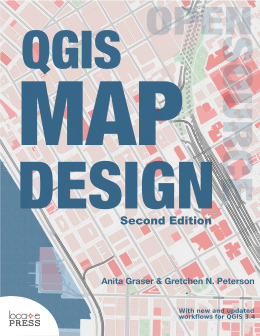
QGIS Map Design
Co-authored with Anita Graser
Learn how to use QGIS to take cartographic products to the highest level. Step-by-step instructions for modern print maps using the latest QGIS long-term release. This second edition looks as though it may become a best seller at LocatePress, just like the first edition.
Available at Amazon and LocatePress.

GIS Cartography
A Guide to Effective Map Design
The third edition of a bestseller, this book focuses on map design theory and technique and constitutes a comprehensive introductory course.
Available at Routledge and elsewhere. Rent or buy the enhanced eBook here.

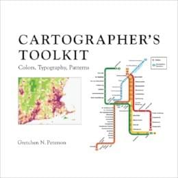
Cartographer's Toolkit
Colors, Typography, Patterns
Like a cheat-sheet for cartography. Comprised of three sections that build from the individual map components of colors and typography up to the comprehensive techniques of layout patterns.
Available at Amazon and elsewhere. Universities and conferences may order in bulk directly through the author or via the Ingram catalog.
These affiliate links benefit the author directly. Thank you.
Learning Cartography
Curated Links
Cartography
- Barber, Peter. The Map Book. Walker & Company, 2005.
- Brewer, Cynthia A. Designing Better Maps: A Guide for GIS Users 2nd Edition. ESRI Press, 2016.
- Brotton, Jerry. Great Maps (Dk Smithsonian). DK, 2014.
- Clarke, Victoria (Editor). Map: Exploring the World. Phaidon Press, 2015.
- Dent, B., Torguson, J., Hodler, T. Cartography: Thematic Map Design. McGraw-Hill Science/Engineering/Math; 6 edition, 2008.
- Graser, Anita and Gretchen N. Peterson. QGIS Map Design Second Edition. Locate Press, 2018. Order the PDF here. Order the print book here or at any other book store.
- Imhof, Eduard. Cartographic Relief Presentation. ESRI Press, 2007.
- Monmonier, Mark. How to Lie with Maps (3rd Edition). University of Chicago Press, 2018.
- Peterson, Gretchen N. Cartographer's Toolkit: Colors, Typography, Patterns. PetersonGIS Press, 2012.
- Peterson, Gretchen N. GIS Cartography: A Guide to Effective Map Design Third Edition. CRC Press, 2020. Order the E-Book, with videos, here.
- Zineddin, Z., P. M. Garvey, R. A. Carlson, and M. T. Pietrucha. "Effects of Practice on Font Legibility," Perception and Performance 4, Human Factors and Ergonomics Society Annual Meeting Proceedings (2007): 1717–1720.
- Carto Blog , a blog for the company Carto, start with posts by Mamata Akella.
- Free and Open Source GIS Ramblings Anita Graser's blog on QGIS and other software technique.
- GeographyRealm (formerly GeoLounge) is a news site that features cartography articles among others.
- The Map Room is a blog about maps, mapping, and technology by Jonathan Crowe.
- The National Geologic Map Database is maintained by the U.S. Geological Survey and contains information on mapping techniques and guidelines.
- Petrichor Geoviz Studio is a blog of sweet (donuts, etc.) cartography techniques.
- The Soil Geographic Data Standard, developed by the Federal Geographic Data Committee (FGDC), describes the standards for mapping soils in the United States with specific regard to the soil data created by the National Cooperative Soil Survey.
- The Utilities Data Content Standard, created by the Federal Geographic Data Committee, is a good resource for looking up the standard attributes of many utility features.
- View from the sky, a blog post by Amy Lee on designing the Cali Terrain map style. See other posts in this blog for more cartography-minded discussions.
Fonts and Icons
- Lupton, Ellen. Thinking with Type, 2nd revised and expanded edition: A Critical Guide for Designers, Writers, Editors, & Students. Princeton Architectural Press; 2 Rev Exp edition, 2010.
- Martin, K., Dodd, R., Davis, G., Gordon, B. 1000 Fonts. Chronicle Books, 2009.
- dafont.com is user community site that allows free downloads of unique fonts.
- exljbris Font Foundry is a company providing some of my favorite fonts.
- Font Awesome is a popular icon font.
- FontStruct is a user community site that allows you to build your own font and download other user's fonts.
- Linotype is a site that contains original, proprietary fonts for purchase.
- The Noun Project has an icon for everything, all in a similar style.
- TypeBrewer is a free map design tool for selecting typography.
- WhatTheFont identifies a font from a user-uploaded screenshot of the desired font.
Colors
- Anderson, J. R., Hardy, E. E., Roach, J. T. and Witmer, R. E. "Land Use and Land Cover Classification System for Use with Remote Sensor Data" (114 KB PDF). Geological Survey Professional Paper 964 (1976). A revision of the land use classification system as presented in U.S. Geological Survey Circular 671.
- Kennelly, P. J. "NOT Mapping Our World." ArcUser, July–September 2007.
- Meihoefer, H. "The Utility of the Circle as an Effective Cartographic Symbol." Cartographica: The International Journal for Geographic Information and Geovisualization 6, no. 2 (1969): 105–117. Article.
- Nighbert, Jeffery S., Department of the Interior, Bureau of Land Management. "Characterizing Landscape for Visualization Through 'Bump Mapping' and Spatial Analysis" (PDF).
- Ovenden, Mike and Ashworth, Mike. Transit Maps of the World. Penguin, 2007. Transit Maps of the World is just one of many books of maps that could provide palette inspiration.
- Patterson, T. and Kelso, N. V. "Hal Shelton Revisited: Designing and Producing Natural-Color Maps with Satellite Land Cover Data." Cartographic Perspectives, Journal of the North American Cartographic Information Society 47, Winter 2004.
- Viridis Palette Generator: easy to use palette generator for viridis, magma, inferno, and plasma color ramps.
- The American Standard Geologic Age Color Scheme (5.2 MB PDF), developed by the U.S. Geological Survey and the Association of American State Geologists, is shown in a reference diagram on this site.
- A Tapestry of Time and Terrain shows the American Standard geologic rock age color scheme with hillshading underneath.
- Color Brewer is a web tool used for selecting map color schemes.
- Color Oracle is a colorblindness simulator that applies a full screen color filter to your design independently of the software in use.
- Color Scheme Designer is an online tool that allows you to interactively choose a color palette using a clickable color wheel.
- COLOURlovers is a site for community contributed palettes. Also see their article titled "Common Color Names for Easy Reference" found here.
- kuler, by Adobe, is another community color site that allows you to browse user's color palettes and view critical feedback.
- MollyMaps' Art Maps is just one of many painted map artists.
- Strange Maps is a widely read blog with a variety of maps and corresponding critiques. These maps are useful to glean ideas on novel approaches and color schemes.
- Vischeck is a website where you can upload a map and have it transform into a graphic that shows you what your map would look like to a color-deficient person.
- Pattern Chart (PDF). In FGDC DigitalCartographic Standard for Geologic Map Symbolization Federal Geographic Data Committee Document Number FGDC_STD_013_2006 (Federal Geographic Data Committee, 2006), p. 290.
- Munsell Software Conversion Program (Version 10).
Web Maps, Animations, and Software Engineering
- NASA's Weekly Arctic Sea Ice Age with Graph of Ice Age By Area: 1984-2019 animation.
- Mark Evans' ACS Commute Map, a time enabled animation of commuting patterns.
- Dylan Moriarty's hurricane animation, on twitter is simple and effective.
- Aladair Rae's animation of London house prices shows off a palette animation.
- Kiri Carini's story map/scrollytelling tools list is a great resource for story map inspiration and tools.
- Large-scale cinematic mapping in Zootopia, explained by Brandon Jarratt in this Esri UC 2017 presentation.
- Muehlenhaus, Ian. Web Cartography: Map Design for Interactive and Mobile Devices. CRC Press, 2013.
- Youngblood, Brian. GeoServer Beginner's Guide. Packt Publishing, 2013.
- CartoDB provides a solution for analyzing GIS data and creating beautiful webmaps with it.
- D3.js is a JavaScript library that you can use to make nice interactive maps. See Scott Murray's tutorials to get started.
- Intro to OGR, Part 1: Exploring Data Safavi explores the software engineering aspects of mapping in this and related posts.
- Mapbox Studio allows you to design and build interactive maps for your websites. Their gallery is full of beautiful maps.
- OpenStreetMap (OSM) is a free service that allows you to contribute to a worldwide basemap by digitizing things into their database. You can also use the OSM data in your own digital and static maps, with a bit of work.
- The Los Angeles Times web map detailing homicides in LA County is a good interactive map example.
Design
- Berinato, Scott. Good Charts: The HBR Guide to Making Smarter, More Persuasive Data Visualizations. Boston, MA: Harvard Business School Publishing Corporation, 2016.
- Bertin, Jacques. Semiology of Graphics: Diagrams, Networks, Maps. ESRI Press, 2010.
- Cairo, Alberto. The Functional Art: An Introduction to Information Graphics and Visualization (Voices That Matter). New Riders, 2012.
- Cairo, Alberto. The Truthful Art: Data, Charts, and Maps for Communications (Voices that Matter). Berkeley, CA: New Riders, 2016.
- Edwards, Betty. Drawing on the Right Side of the Brain, The Definitive: 4th Edition. Tarcher, 2012.
- Few, Stephen. "Save the Pies for Dessert" (600 KB PDF). Perceptual Edge Visual Business Intelligence Newsletter, 2007.
- Few, Stephen. Information Dashboard Design: Displaying Data for At-a-Glance Monitoring Second Edition. Analytics Press, 2013.
- Squatriglia, Chuck. "Mapmakers' Sleight of Hand: Cartographers Put 'Bunnies' on the Map, Tricking Copycats, Sometimes Tourists." San Francisco Chronicle, 12 August, 2001.
- Tufte, Edward. Beautiful Evidence. Graphics Press, 2006.
- Tufte, Edward. Envisioning Information. Graphics Press, 1990.
- Tufte, Edward. The Visual Display of Quantitative Information, 2nd edition. Graphics Press, 2001.
- Ware, Colin. Visual Thinking: for Design (Morgan Kaufmann Series in Interactive Technologies). Morgan Kaufmann, 2008.
- MapLab presents cartographic articles exploring all things cartographic.
- Smashing Magazine presents inspiring articles on web design, typography, and user experience.
- Visual Cinnamon, a data visualization blog by Nadieh Bremer.
Creativity
- Baynton-Williams, Ashley. The Curious Map Book. University of Chicago Press, 2015.
- Byttebier, Igor and Ramon Vullings. Creativity Today. BIS Publishers, 2009.
- Catmull, Ed and Amy Wallace. Creativity, Inc.: Overcoming the Unseen Forces That Stand in the Way of True Inspiration. Random House, 2014.
- Harmon, Katharine. The Map as Art: Contemporary Artists Explore Cartography. Princeton Architectural Press, 2009.
- Harmon, Katharine. You Are Here: Personal Geographies and Other Maps of the Imagination. Princeton Architectural Press, 2003.
- Jacobs, Frank. Strange Maps: An Atlas of Cartographic Curiosities. Studio, 2009.
- Lessig, Lawrence (Professor of Law, Stanford University). Laws that choke creativity, video.
- Weiner, Eric. The Geography of Genius: A Search for the World's Most Creative Places from Ancient Athens to Silicon Valley. Simon & Schuster, 2016.
- David Rumsey Historical Map Collection
- The Getty
- Louvre
- The Museum of Modern Art
- National Gallery of Art
- Smithsonian American Art Museum


© 2022